
Creating a UI Plugin Framework in React
So you want your React-based UI to support plugins that can customize the UI? Here's how I made that happen in a previous project.
My goal was to support many different types of customization. For example, adding a link to an existing navigation bar or adding a button to an existing toolbar should be easy to do. Or maybe a plugin wants to display some widget after the content of a page, or before it. Or maybe a plugin wants to completely hide some standard UI element.
The core idea
Here's the basic idea: major areas of the application UI are designated as Slots, and each slot contains by default a list of widgets that will appear in the slot. Plugins can then add widgets to a slot (at the beginning, end, or middle), or hide, replace ("modify"), or wrap any of the widgets in the slot.
This is done with the <UISlot /> React component, which accepts these properties:
interface Props<ContentType = React.ReactElement> {
    defaultContents?: readonly UISlotWidget<ContentType>[];
    slotId: string;
    renderWidget: (widget: UISlotWidget<ContentType>) => React.ReactElement;
}
Each of the "Widgets" that can go into a slot (via defaultContents) have the following type, which basically wraps a React element (or other piece of data) and gives it an ID:
/** Some widget that appears in a UI slot */
export interface UISlotWidget<ContentType = React.ReactElement> {
    id: string;
    content: ContentType;
    priority: number;  // Priority, 0 comes first, 100 comes last
    hidden?: boolean;  // If a widget in a slot is hidden, it won't be rendered at all.
}
The exact implementation of <UISlot /> will come at the end; for now all that matters is that it can be used to define a "slot" in the UI, and given a default list of widgets to render in that slot.
Example: Converting your UI to slots
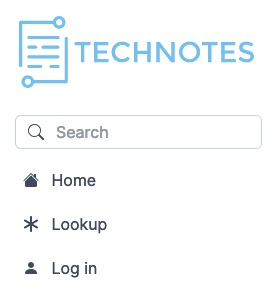
So, let's say you have a navigation bar that looks like this:

We're going to start by turning those three links ("Home", "Lookup", and "Drafts") into a slot.
First, we define what data we need about each link that appears in the slot:
export interface NavLink {
    label: React.ReactElement;  // The text to display as the link
    icon?: IconId;
    url: string;
}
Then we define the default links that will be shown:
const defaultLinks: UISlotWidget<NavLink>[] = [
    {
        id: "home",
        priority: 5,
        content: { url: "/", icon: "house-fill", label: <FormattedMessage defaultMessage="Home" /> },
    },
    {
        id: "lookup",
        priority: 25,
        content: { url: "/lookup", icon: "asterisk", label: <FormattedMessage defaultMessage="Lookup" /> },
    },
    {
        id: "drafts",
        priority: 35,
        content: { url: "/drafts", icon: "file-earmark-diff", label: <FormattedMessage defaultMessage="Drafts" /> },
    },
];
Then we define the "slot" in our sidebar where the links will appear, as well as how each link should be rendered:
export function LeftSidebar = (props) => {
    return <div>
        {/* Site Logo */}
        {/* Search box */}
        {/* Main navigation links: */}
        <UISlot<NavLink>
            slotId="main-nav"
            defaultContents={defaultLinks}
            renderWidget={(link) => (
                <a
                    href={link.content.url}
                    key={link.id}
                    className={`
                        block rounded-md px-2 py-2 [&>svg]:mr-2 truncate
                        ${isActive(link.content.url) ? `bg-slate-100 text-slate-800` : `text-slate-600 hover:text-black hover:bg-slate-50`}
                    `}>
                    <Icon icon={link.content.icon}/> {link.content.label}
                </a>
            )}
        />
    </div>
}
(If you're wondering, <FormattedMessage ... /> is to use react-intl to translate the link text, the CSS classes are Tailwind, and the icons are Bootstrap Icons.)
Now, the navigation bar will initially look exactly the same - but it's now a UISlot with the ID main-nav, and that means it can now be customized by plugins!
Creating a plugin
Let's say we want to implement a plugin that makes the "Drafts" link only visible to administrators, and which inserts a new "Login" link.
First, we need to define the types of changes that a plugin can make:
export enum UiChangeOperation {
    Insert = "insert",
    Hide = "hide",
    Modify = "modify",
    Wrap = "wrap",
}

export type UiSlotChange =
    | { op: UiChangeOperation.Insert; widget: UISlotWidget<unknown> }
    | { op: UiChangeOperation.Hide; widgetId: string }
    | { op: UiChangeOperation.Modify; widgetId: string, fn: (widget: UISlotWidget<unknown>) => UISlotWidget<unknown> }
    | { op: UiChangeOperation.Wrap; widgetId: string, wrapper: React.FC<{widget: React.ReactElement}> };
Then, we define what a plugin looks like:
export interface PluginDefinition {
    id: string;
    getUiSlotChanges?: (context: unknown) => Partial<Record<string, UiSlotChange[]>>;
}
Then, we can create our first plugin!
// plugins/DemoPlugin/index.tsx
import { PluginDefinition, UiChangeOperation } from "components/UISlot";

export const plugin: PluginDefinition = {
    id: "demo",
    getUiSlotChanges() {
        return {
            "main-nav": [
                // Hide the "Drafts" link, except for administrators:
                {
                    op: UiChangeOperation.Wrap,
                    widgetId: "drafts",
                    wrapper: HideExceptForAdmin,
                },
                // Add a new login link:
                {
                    op: UiChangeOperation.Insert,
                    widget: { id: "login", priority: 50, content: {
                        url: "/login", icon: "person-fill", label: <FormattedMessage defaultMessage="Login" />
                    }},
                },
            ],
        };
    },
};

/** This is a React widget that wraps its children and makes them visible only to administrators */
const HideExceptForAdmin: React.FC<{widget: React.ReactElement}> = ({widget}) => {
    const isAdmin = useRole(CoreRoles.isAdmin);  // This line would vary depending on your application
    return <React.Fragment key={widget.key}>{isAdmin ? widget : null}</React.Fragment>;
}
Installing the plugin
Now we want the plugin to actually get used in our app. First, we define a React Context to store the list of enabled plugins:
export const UiPluginsContext = React.createContext<PluginDefinition[]>([]);
Now, we can use that context in our app's root file so that the <UISlot /> components throughout the whole app will know what plugins are enabled.
// _app.tsx
import { UiPluginsContext } from "components/UISlot";
import { plugin as DemoPlugin } from "plugins/DemoPlugin"

export default function MyAwesomeReactApp(props) {
    // ...

    // List all the enabled plugins:
    const enabledPlugins = [
        DemoPlugin,
    ];

    return (
        <UiPluginsContext.Provider value={enabledPlugins}>
            // your app root elements and other context providers like <IntlProvider> are here
        </UiPluginsContext.Provider>
    );
}
The list of plugins is just hard-coded for now. While you're just getting started with plugins, I recommend you keep it simple and just hard-code the list. Later, once everything is working well, you can play around with configuration-based plugin loading or even dynamic loading at runtime. Just beware that getting too fancy with dynamic loading and webpack can be a pain and can prevent some bundle size optimizations, so I recommend dynamic loading only if (A) different parts of your app need different plugins, and (B) some of your plugins are large enough that loading all plugins for all users is not an option.
In the spirit of keeping it simple, for most applications I would recommend evolving from a hard-coded list of plugins to a build step in your app's build/deploy pipeline. This build step can read configuration, e.g. from environment variables, then npm install the plugins you want to use (if necessary), then write out the list of installed plugins to a .js/.ts file that will get read by your app.
Result of our demo plugin
Now save your changes and you'll see the result immediately:
Drafts is gone, and Login is now there!
A common need: wrapping a single element
A very common need is to just mark some existing component in your UI as a "slot" so that plugins can prepend/append UI to it or wrap it in some way. In such a case, using the whole <UISlot /> interface is tedious. So I created a simple wrapper component for these situations, DefaultUISlot:
export const DefaultUISlot: React.FunctionComponent<{ slotId: string; children?: React.ReactNode }> = (props) => {
    return (
        <UISlot
            slotId={props.slotId}
            renderWidget={defaultRender}
            defaultContents={props.children ? [{ id: "content", priority: 50, content: <>{props.children}</> }] : []}
        />
    );
};
With <DefaultUISlot>, it's now trivial to make any part of your UI pluggable. You just wrap it in <DefaultUISlot>...</DefaultUISlot>. For example, say we want plugins to be able to customize the site logo or put content before/after it. Just wrap it in <DefaultUISlot>:
<DefaultUISlot slotId="siteLogo">
    <Link href="/" className="..."><SiteLogo /></Link>
</DefaultUISlot>
Done! No other changes are required.
Taking it further
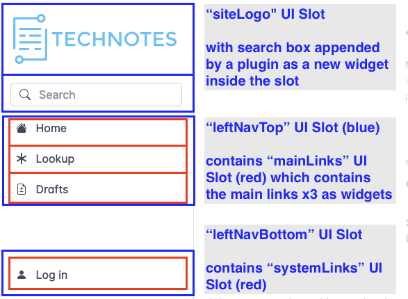
This <UISlot /> paradigm is really useful and flexible. You can use nested slots to allow fine-grained customization of the UI. In the left sidebar example, I actually have two layers of UI slots: the first defines the major "panels" like "top panel" (site UI), "main nav", and "bottom nav" and then within each nav panel there is a UI slot to customize the links:
<div id="left-panel">
    {/* Site name/logo */}
    <DefaultUISlot slotId="siteLogo">
        <Link href="/" className="..."><SiteLogo /></Link>
    </DefaultUISlot>

    <UISlot slotId="leftNavTop" defaultContents={[
        ...(props.leftNavTopSlot ?? []),
        {
            id: "mainLinks",
            priority: 10,
            content: <UISlot slotId="mainLinks" defaultContents={defaultLinks} renderWidget={renderLinks} />,
        },
    ]} renderWidget={defaultRender} />

    <div className="flex-auto">{/* This is a spacer that pushes the "bottom" content to the end */}</div>

    <UISlot slotId="leftNavBottom" defaultContents={[
        ...(props.leftNavBottomSlot ?? []),
        {
            id: "systemLinks",
            priority: 40,
            content: <UISlot slotId="mainLinks" defaultContents={defaultSystemLinks} renderWidget={renderLinks} />,
        },
    ]} renderWidget={defaultRender} />
</div>
Here's how the above code could look in practice:
And here's a real example of a plugin heavily modifying the interface of an MIT site that uses our application.

- A totally new sticky header is added to every page (theming).
- A comment widget is injected at the end of every article.
- The links in the main nav bar are replaced, and the new links don't use icons.
- The "system links" at the bottom left are hidden entirely.
The Code
To use this in your own application, here is the code for <UISlot> and friends, which you can use as a starting point. Why have I not made this into a reusable npm package, you ask? First of all, people make too many small npm packages, and it causes dependency hell. In this case, there really isn't much code to <UISlot>, and you can easily just copy it into your application. But the bigger reason is that plugins and UI slots probably need to work quite differently in different applications, and I want you to be able to easily customize this for your specific use case. For example, you probably want the UI plugins to be able to add new URLs to the router; the details of how to do that depend on what React routing framework you're using. But if you control the PluginDefinition interface, that's quite easy to do. As another example, in my original use case we needed to support muli-tenancy and white labelling, so the plugin context was actually split into two (installed plugins vs. enabled plugins for the current site, plus per-site configuration that gets passed into each plugin). You probably don't need that, nor want to see that complexity in the code. So: here's the code as a starting point. Copy and customize this code as you need!
/**
 * UiSlot.tsx by Braden MacDonald
 * @copyright (c) 2023 MacDonald Thoughtstuff Inc.
 * @license Unlicense (see https://unlicense.org/ - public domain, use as you will, but no warranty of any kind)
 */
import React from "react";

/** Some widget that appears in a UI slot */
export interface UISlotWidget<ContentType = React.ReactElement> {
    id: string;
    content: ContentType;
    priority: number;  // Priority, 0 comes first, 100 comes last
    hidden?: boolean;  // If a widget in a slot is hidden, it won't be rendered at all.
}

/** Props accepted by <UISlot/> */
interface Props<ContentType = React.ReactElement> {
    defaultContents?: readonly UISlotWidget<ContentType>[];
    slotId: string;
    renderWidget: (widget: UISlotWidget<ContentType>) => React.ReactElement;
}


/**
 * A UI slot is a placeholder in the user interface that can be filled with various content/widgets, and in particular
 * which plugins can modify.
 */
export const UISlot = function <ContentType = React.ReactElement>(props: Props<ContentType>) {
    // Allow any plugins that are active for this site to modify this UI slot:
    const enabledPlugins = React.useContext(UiPluginsContext);

    const contents = React.useMemo(() => {
        const contents: (UISlotWidget<ContentType> & {wrappers?: React.FC<{widget: React.ReactElement}>[]})[] = [...props.defaultContents ?? []];
        for (const p of enabledPlugins) {
            const changes = p.getUiSlotChanges( ... ); // Optional: Pass in any app-specific context that the plugin may want
            for (const change of (changes[props.slotId] ?? [])) {
                if (change.op === UiChangeOperation.Insert) {
                    contents.push(change.widget as UISlotWidget<ContentType>);
                } else if (change.op === UiChangeOperation.Hide) {
                    const widget = contents.find((w) => w.id === change.widgetId);
                    if (widget) { widget.hidden = true; }
                } else if (change.op === UiChangeOperation.Modify) {
                    const widgetIdx = contents.findIndex((w) => w.id === change.widgetId);
                    if (widgetIdx >= 0) {
                        const widget = {...contents[widgetIdx]};
                        contents[widgetIdx] = change.fn(widget) as UISlotWidget<ContentType>;
                    }
                } else if (change.op === UiChangeOperation.Wrap) {
                    const widgetIdx = contents.findIndex((w) => w.id === change.widgetId);
                    if (widgetIdx >= 0) {
                        const newWidget = {wrappers: [], ...contents[widgetIdx]};
                        newWidget.wrappers.push(change.wrapper as React.FC<{widget: React.ReactElement}>);
                        contents[widgetIdx] = newWidget;
                    }
                } else {
                    throw new Error(`unknown plugin UI change operation: ${(change).op}`);
                }
            }
        }
        // Sort first by priority, then by ID
        contents.sort((a, b) => (a.priority - b.priority) * 10_000 + a.id.localeCompare(b.id));
        return contents;
    }, [props.defaultContents, enabledPlugins, props.slotId]);

    return (
        <>
            {contents.map((c) =>
                c.hidden ? null :
                c.wrappers ? (
                    c.wrappers.reduce((widget, wrapper) =>
                        React.createElement(wrapper, {widget, key: c.id}), props.renderWidget(c)
                    )
                )
                : props.renderWidget(c)
            )}
        </>
    );
};

/**
 * Default "render" method for a <UiSlot>.
 * Assumes "content" is a React component and just renders it normally.
 */
export const defaultRender = (widget: UISlotWidget<React.ReactElement>) => (
    <React.Fragment key={widget.id}>{widget.content}</React.Fragment>
);

/**
 * A UI slot is a placeholder in the user interface that can be filled with various content/widgets, and in particular
 * which plugins can modify. This particular type of UI slot just wraps any React component and allows plugins to insert
 * HTML before it or after it, or to hide it.
 */
export const DefaultUISlot: React.FunctionComponent<{ slotId: string; children?: React.ReactNode }> = (props) => {
    return (
        <UISlot
            slotId={props.slotId}
            renderWidget={defaultRender}
            defaultContents={props.children ? [{ id: "content", priority: 50, content: <>{props.children}</> }] : []}
        />
    );
};

/////// Code for plugins ///////

export enum UiChangeOperation {
    Insert = "insert",
    Hide = "hide",
    Modify = "modify",
    Wrap = "wrap",
}

/** Ways in which a plugin can modify a UI Slot */
export type UiSlotChange =
    | { op: UiChangeOperation.Insert; widget: UISlotWidget<unknown> }
    | { op: UiChangeOperation.Hide; widgetId: string }
    | { op: UiChangeOperation.Modify; widgetId: string, fn: (widget: UISlotWidget<unknown>) => UISlotWidget<unknown> }
    | { op: UiChangeOperation.Wrap; widgetId: string, wrapper: React.FC<{widget: React.ReactElement}> };

/** Declaration for a UI plugin */
export interface PluginDefinition {
    id: string;
    getUiSlotChanges?: (context: unknown) => Partial<Record<string, UiSlotChange[]>>;
    // Add other stuff here, like a function to add new URL routes to the router so plugins can add whole new pages.
}

/** Context which makes the list of enabled plugins available to the <UISlot> components below it in the React tree */
export const UiPluginsContext = React.createContext<PluginDefinition[]>([]);